
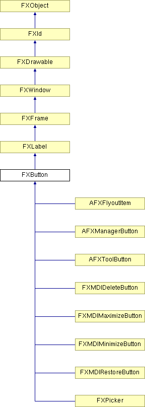
A button provides a push button, with optional icon and/or text label. When pressed, the button widget sends a SEL_COMMAND to its target.
Construct button with text and icon.
| Argument | Type | Default | Description |
| p | FXComposite | ||
| text | String | ||
| ic | FXIcon | None | |
| tgt | FXObject | None | |
| sel | Int | 0 | |
| opts | Int | BUTTON_NORMAL | |
| x | Int | 0 | |
| y | Int | 0 | |
| w | Int | 0 | |
| h | Int | 0 | |
| pl | Int | DEFAULT_PAD | |
| pr | Int | DEFAULT_PAD | |
| pt | Int | DEFAULT_PAD | |
| pb | Int | DEFAULT_PAD |
Returns True because a button can receive focus.
Reimplemented from FXWindow.
Reimplemented in AFXFlyoutItem.
Set the button style flags.
| Argument | Type | Default | Description |
| style | Int |
Set as default button.
Reimplemented from FXWindow.
| Argument | Type | Default | Description |
| enable | Bool | True |
Button state bits
| STATE_UP | Button is up. |
| STATE_DOWN | Button is down. |
| STATE_ENGAGED | Button is engaged. |
| STATE_UNCHECKED | Same as STATE_UP (used for check buttons or radio buttons). |
| STATE_CHECKED | Same as STATE_ENGAGED (used for check buttons or radio buttons). |
Button flags
| BUTTON_AUTOGRAY | Automatically gray out when not updated. |
| BUTTON_AUTOHIDE | Automatically hide button when not updated. |
| BUTTON_TOOLBAR | Toolbar style button [flat look]. |
| BUTTON_DEFAULT | May become default button when receiving focus. |
| BUTTON_INITIAL | This button is the initial default button. |
| BUTTON_NORMAL | Normal button style. |